The challenge
As a manufacturer of high-quality architectural lighting fixtures, Visioluce aims to create innovative and aesthetic products that offer a quality lighting experience and surpass the expectations of its customers.
Visioluce’s challenge is to compete on equal terms with established names in the field: manufacturers who combine performance and style, most of them Italian, who treat their products as real works of art. Even though it seems an impossible task, Visioluce has the technical capacity and aesthetic skills not only to produce, but also to innovate in the field through its specialists. And if you’re building the future, your brand shouldn’t look like the past.
Strategy
Visioluce’s brand is serving a specific market: architects, interior design studios, and institutions seeking to convey emotion through lighting. When we started working together, the brand was just a simple business line which we named, designed, and built together with its creators.
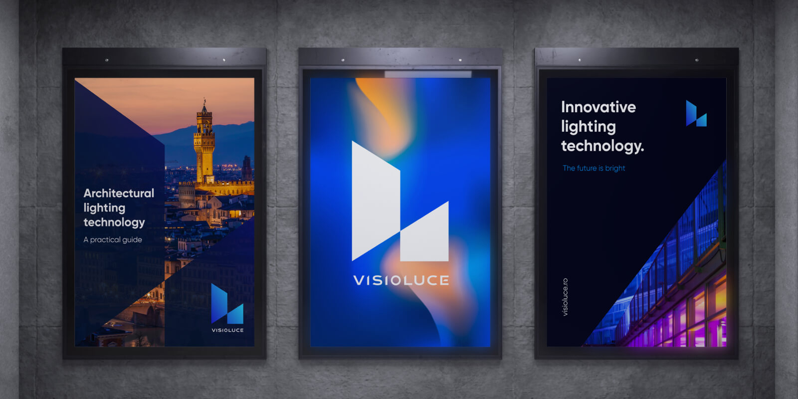
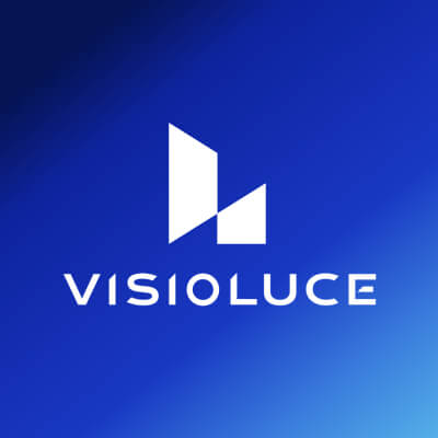
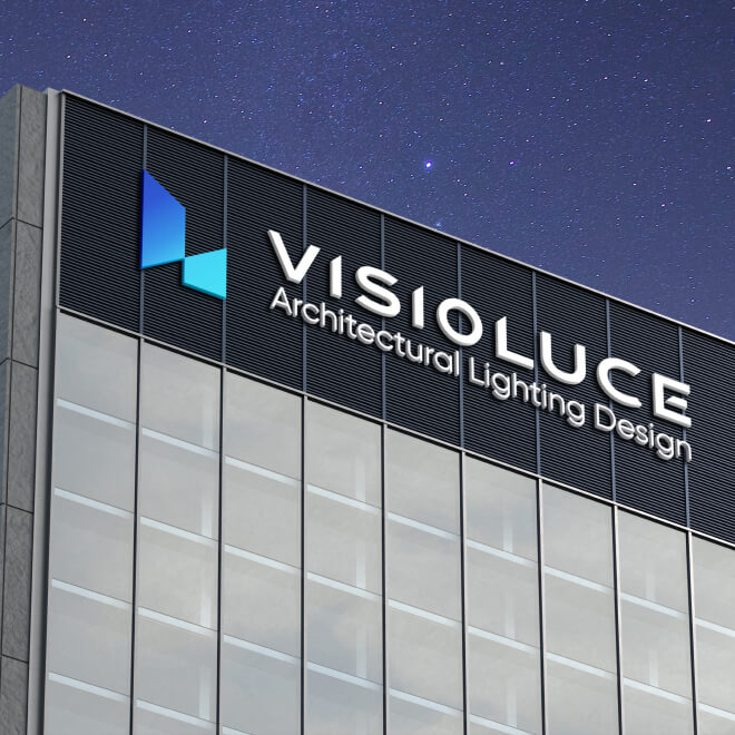
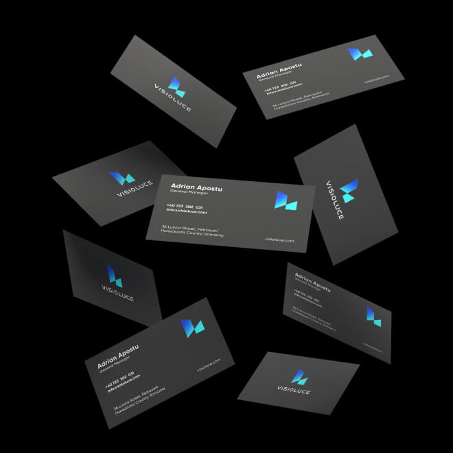
Visually, such brands must communicate attention to detail, innovation, and good taste. To achieve the perfect mix requires numerous conceptualizations, tests, and sketches. The winning candidate for the logo was the symbol of abstracted buildings made of beams of various orientations, imitating the way light emphasizes certain areas of interest in buildings. Also in the symbol, we distinguish an “L”, the initial of the word “luce” – light in Italian.
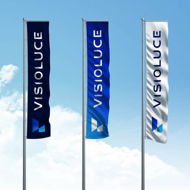
The dominant colors of the palette, navy blue (#021459) and charcoal gray (#221F1F), with their dark and sophisticated tones, create a feeling of luxury, professionalism, and trust. They evoke authority and excellence, perfectly aligning with the brand’s premium image. The secondary shades, light gray (#808184) and white (#FFFFFF), provide a subtle contrast, balancing the dominance of the dark tones. Light gray adds a touch of modernity and elegance, while white brings a touch of cleanliness and precision, emphasizing the brand’s commitment to high-quality technical lighting.
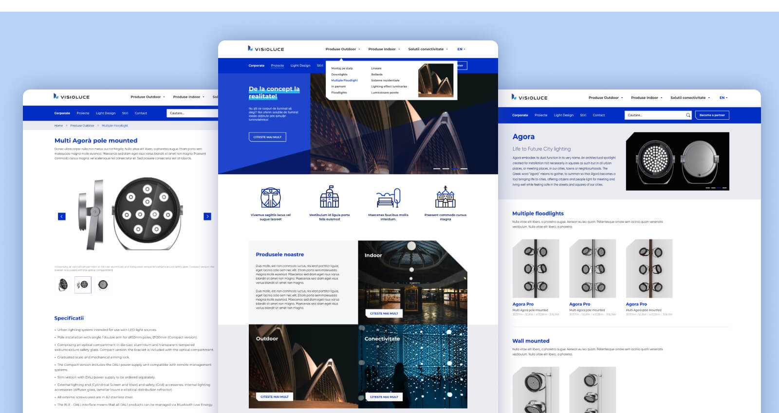
First of all, we developed a memorable name for the brand, reflecting its market position. Continuing with the premium brand strategy, we also handled its implementation in various materials. For the online presence, we created a website from scratch – including web design and development. The website itself was an interesting challenge; because, in addition to the need for captivating design, we had to create product pages that would generate technical sheets from thousands of variables available for item customization. We managed to develop an intuitive and user-friendly interface that allows easy navigation through complex product information without sacrificing the overall aesthetics of the website.
If you're building the future, your brand shouldn't look like the past.
Outcomes
For premium brands like Visioluce, a consistent brand strategy across all customer touchpoints is incredibly important. We focused on building a cohesive brand experience, from the initial naming to the website and social media. We’re proud of how we brought Visioluce’s brand strategy to life, creating a visually appealing website and a distinctive visual identity that truly reflects their premium nature