The challenge
Downtown Arad wasn’t lacking restaurants. It was lacking energy.
A local entrepreneur spotted the opportunity: a new location, a clear concept — fried chicken in all its forms — and a precise target audience: Generation Z. The recipe was already in place. The real challenge was building a brand that couldn’t be ignored.
Gen Z doesn’t buy products — they buy identities. A place that doesn’t speak their language becomes invisible within three seconds. Many competitors looked good on paper, but generic in reality: standard fast-food colors, recycled messaging, and borrowed characters. We had to create something instantly recognizable, authentic, and desirable for an audience with the most educated visual instinct in consumer history.
Strategy
We started from a simple truth: for Gen Z, a restaurant isn’t a place where you eat — it’s a place where you identify.
Strategy Workshops
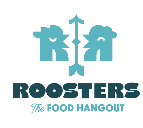
Everything started before a single pixel was designed. We ran brand strategy workshops where we explored the target audience’s preferences, behaviors, and visual reflexes in depth. We defined the positioning, key messaging, brand personality, and color direction. We chose a saturated, bold palette that was impossible to overlook — colors that scream energy, not shopping mall fast food.
A central part of the strategy was defining how the brand speaks: what kind of characters it adopts, what tone it uses, and what it will never say. Gen Z can detect fake instantly. Deliberate authenticity was the only option.
Space as a Brand Medium
We met with the architect and interior designer before any design decisions were made. We researched similar locations, shared our visual direction, and identified the key impact zones where the brand could speak the loudest. Our concepts were integrated into the interior design project, with every custom element created to amplify the visual identity throughout the space.
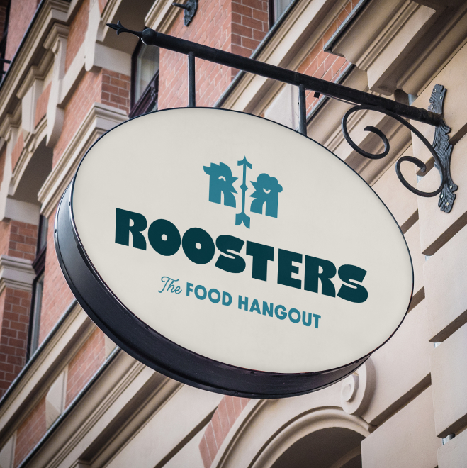
We later collaborated with the architect on the illuminated storefront signage — the street-level visibility element that introduces the brand before anyone walks through the door.
Signage Executed Without Compromise
We returned to the location with our production partner. We measured, verified, and calibrated. Print files were delivered in exact dimensions, prepared for flawless execution. No element left production without being checked against the Style Guide specifications.
Packaging That Photographs Well
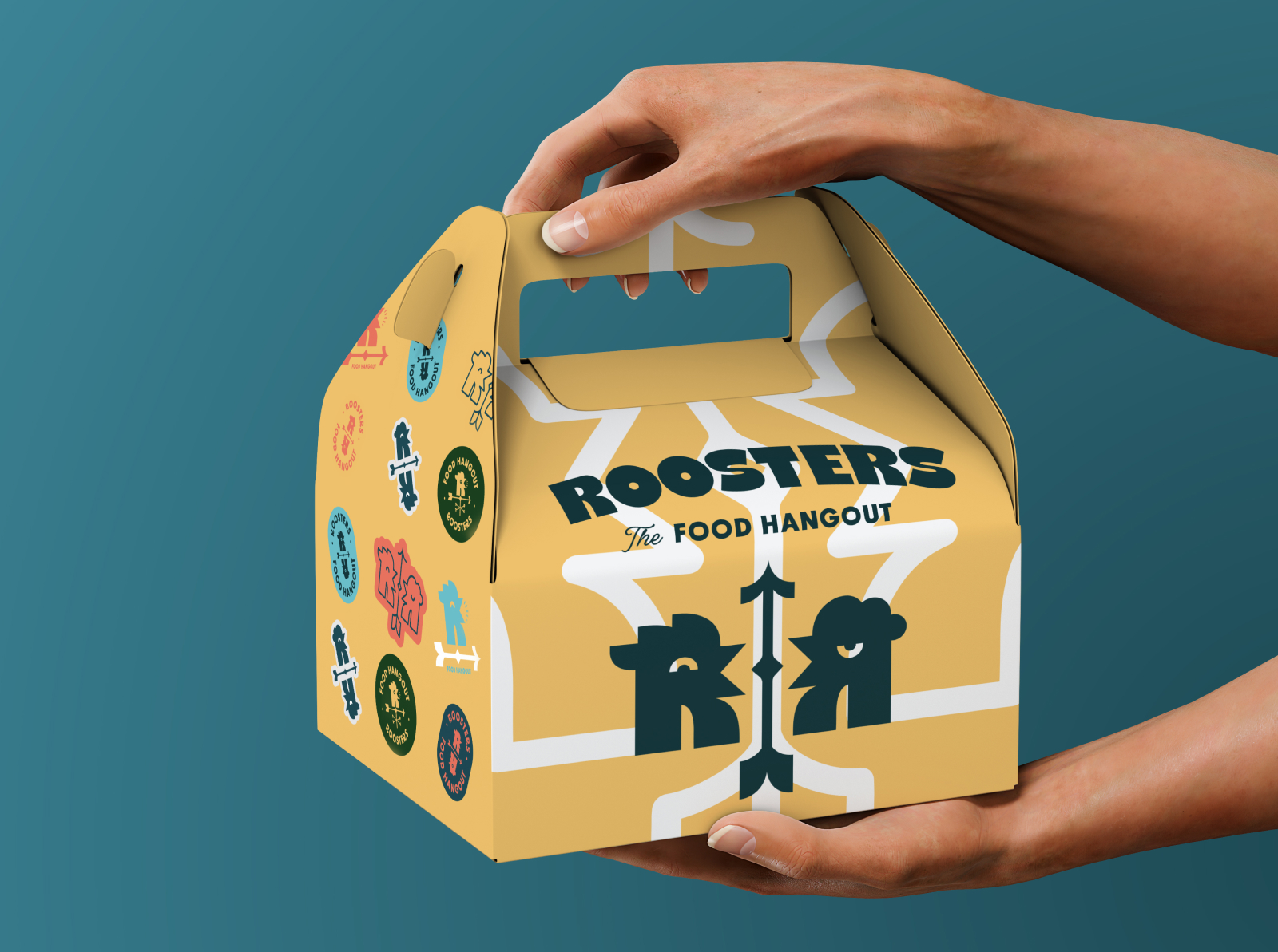
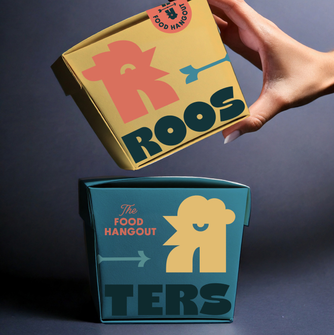
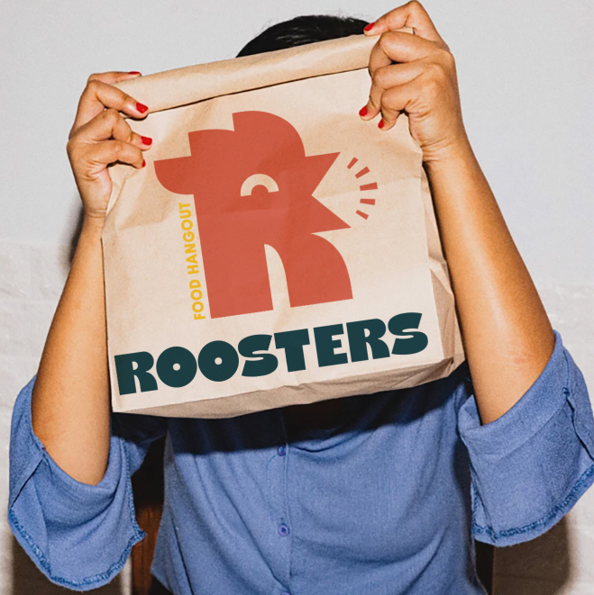
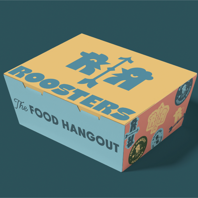
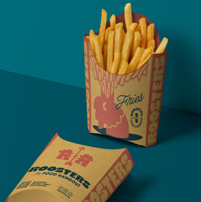
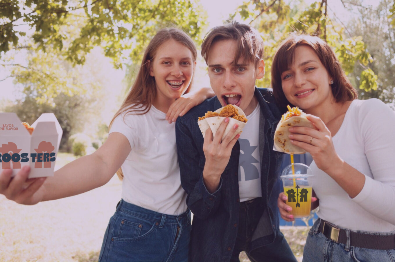
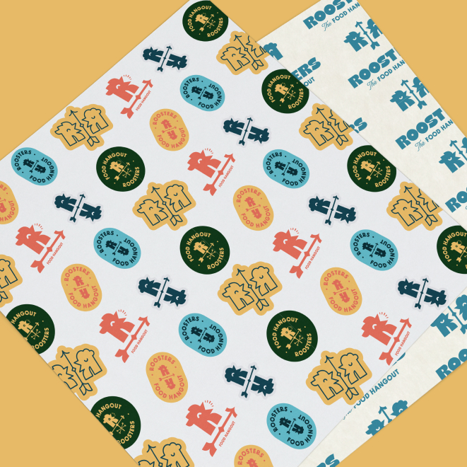
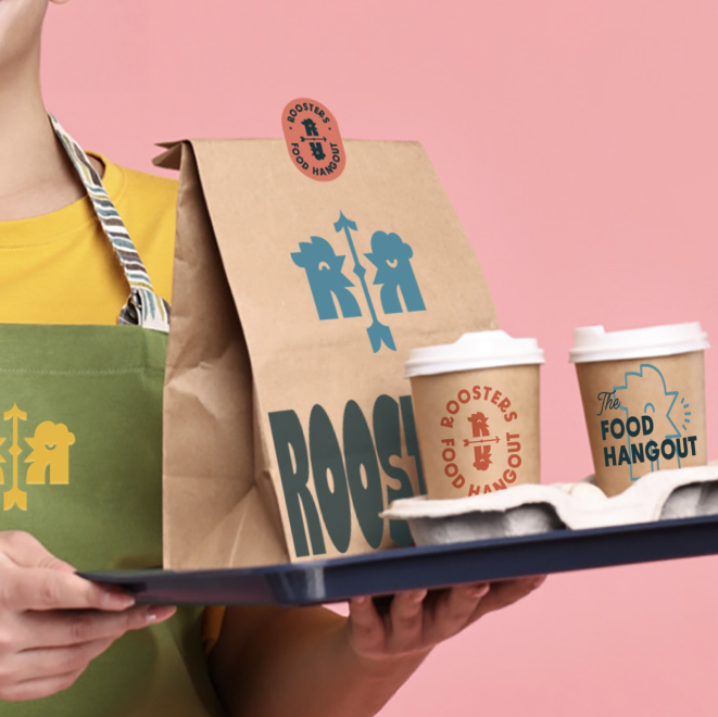
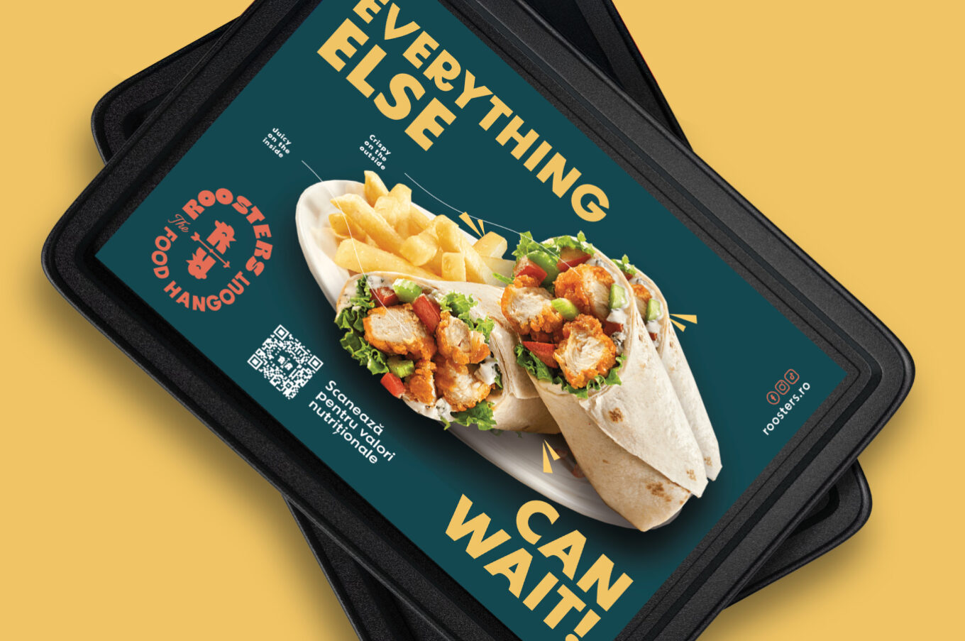
We worked closely with packaging suppliers to create a complete system: boxes, wrapping paper, and bags. Everything was designed for an audience that takes a photo before taking a bite. Packaging isn’t a container — it’s a communication channel and a reason for organic sharing.
Copywriting in Every Corner
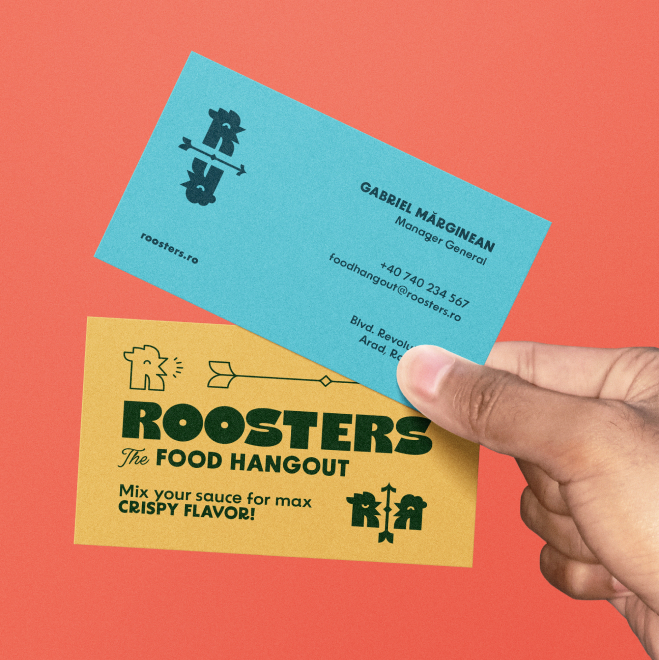
One of the most underestimated decisions in the project was treating every text surface as a communication medium. We wrote the messaging for labels, tray liners, sauce packaging, and boxes — every line calibrated to the Roosters tone: direct, confident, and free of fast-food clichés. Packaging that makes you smile before opening the box is already half the experience.
The Digital Ecosystem
We created a set of social media templates designed to be instantly recognizable, easy to manage, and perfectly aligned with the offline visual identity. The same language. The same energy. The same color palette.
Style Guide for Every Partner
Consistency doesn’t happen by accident — it is designed. At the end of the project, we delivered a detailed Style Guide with precise color specifications and clear application rules for every partner involved: print producers, packaging suppliers, and signage collaborators.
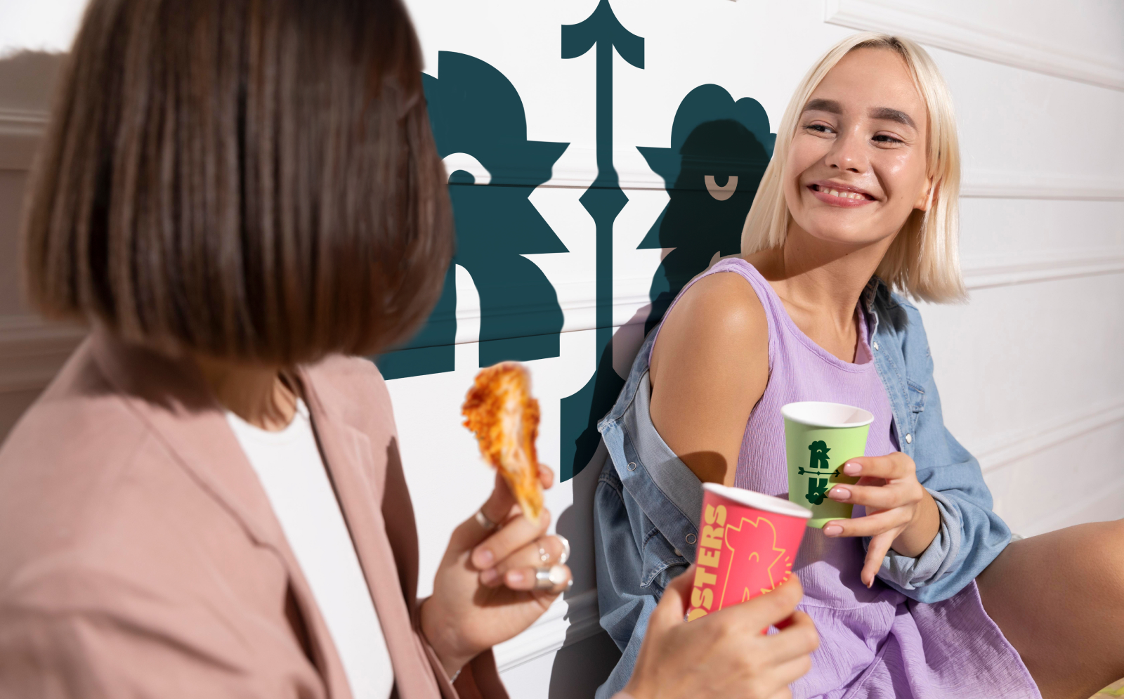
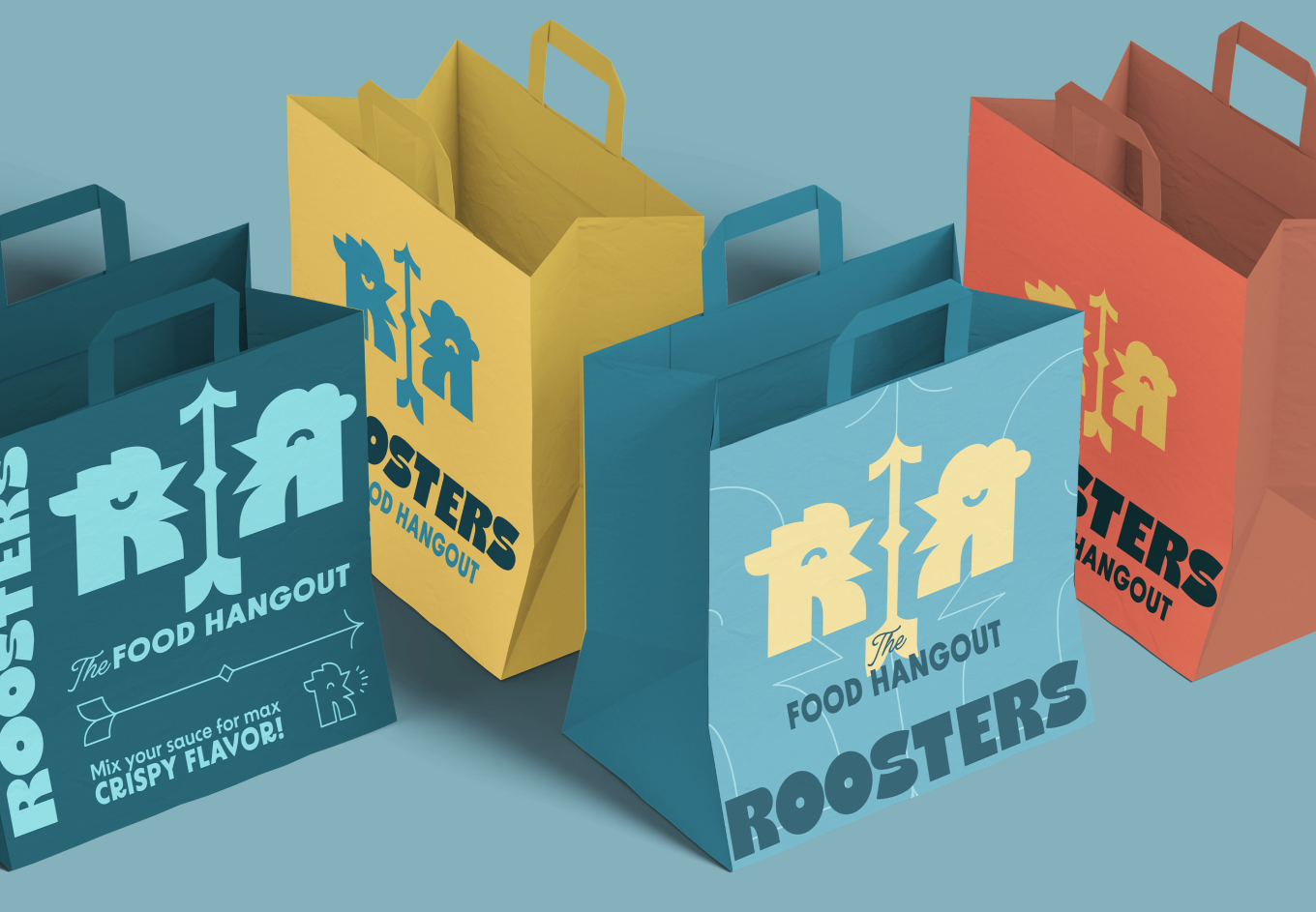
Gen Z doesn’t buy products — they buy what reflects their identity. Our mission was to build a brand they could see themselves in.
Outcomes
The opening of Roosters became a memorable moment. The space generated immediate excitement among both customers and the local community, while the food proved that the brand was backed by real substance, not just aesthetics.
From day one, the brand was complete, cohesive, and consistently executed across every touchpoint — from the illuminated sign at the entrance to the label on the sauce packet on the table. Online and offline spoke the same language, without inconsistencies or last-minute improvisation. Even the smallest copy detail — a line on a tray liner or a message on a box — carried the same personality.
The strategy laid the foundation for authentic communication with the Gen Z audience: believable characters, messaging that resonates, and a clear positioning that doesn’t imitate trends but integrates naturally into them.
Roosters didn’t enter the market as a new restaurant. It entered as a fully formed brand.