The challenge
Play-games.com was already an established player in the online entertainment market—with a loyal user base and an extensive catalog of games. But behind the traffic lay a problem that the numbers couldn’t hide forever: the brand wasn’t speaking to anyone in particular.
The visual identity had accumulated layers of hasty decisions, lacking a unifying strategic direction. The mascot—the element with the greatest potential for emotional connection—was undefined and underutilized. The tone of communication wavered. And the user, increasingly sophisticated and hard to win over, no longer responded to a platform that looked like any other.
The real challenge wasn’t a redesign. It was a reconstruction of the identity—with every piece in its place, from strategy to pixel.

Strategy
We convinced the Play-games.com team that any visual intervention without a strategic foundation is an expense, not an investment. Before touching any design elements, we needed to understand who the brand is, who it exists for, and what promise it makes at every touchpoint.
The process began with a series of 4–5 interactive online strategic workshops facilitated with the client’s team. We didn’t deliver an “agency-style” brand strategy—we built it together, uncovering truths about the company that even they hadn’t always articulated clearly.
We defined, step by step:
The brand’s purpose, mission, and vision—why Play-games.com exists beyond simply generating traffic, and what it aims to represent in the long term for its users.
The value system—the attributes, values, and brand archetype that shape the platform’s distinct personality and guide all of its communication decisions.
Consumer profile — not a generic demographic, but a nuanced portrait: personality, desires, sought-after benefits, barriers, and fears. The online gamer of 2026 is different from the one of ten years ago, and the brand had to reflect this reality.
Touchpoint Map — all relevant touchpoints, prioritized by impact and frequency.
Brand Story and Communication Strategy — what the brand says, how it says it, to whom, and on which channel. A coherent message that works equally well on a display banner, on social media, or within the platform experience.
Brand Positioning Statement — a clear and concise statement of the place Play-games.com occupies in the user’s mind: who we are, what we do, for whom, how, and why.
The Solution
With the strategy in place, we moved on to developing the visual identity—a process that was just as rigorous, organized into distinct and validated phases.
Research and visual direction. We analyzed competitors, documented relevant visual styles in the gaming industry, and held in-depth discussions with the team about differentiation and direction. Every subsequent aesthetic decision had a strategic justification.
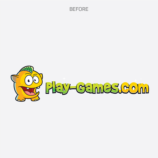
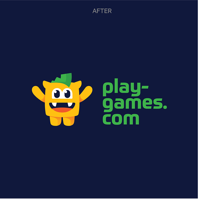
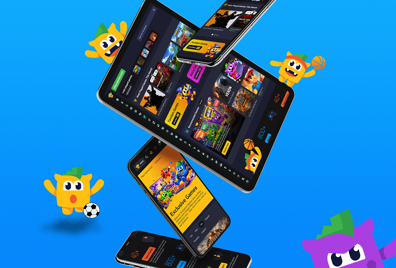
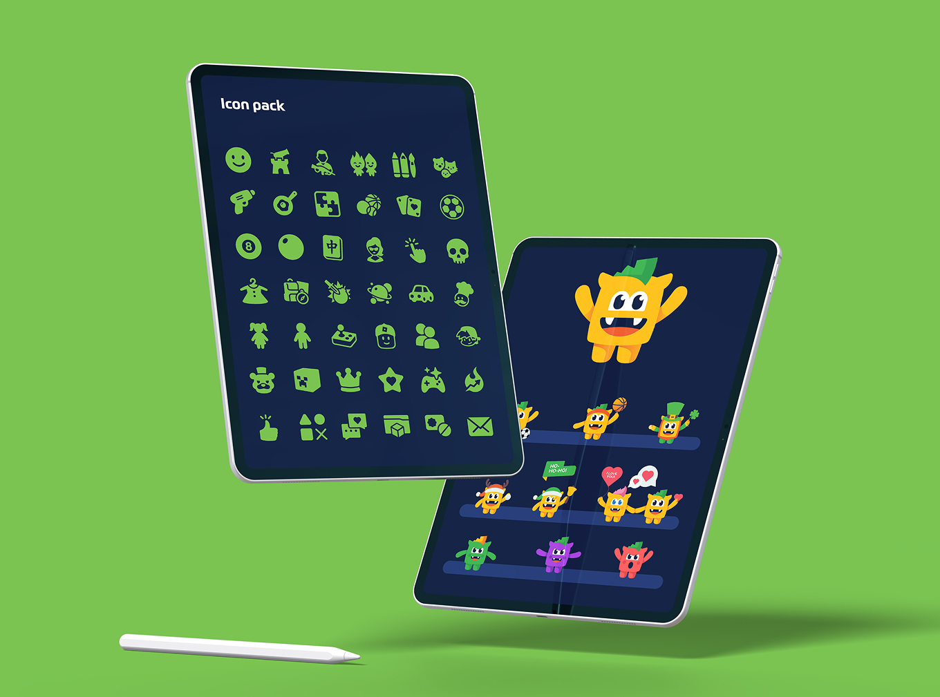
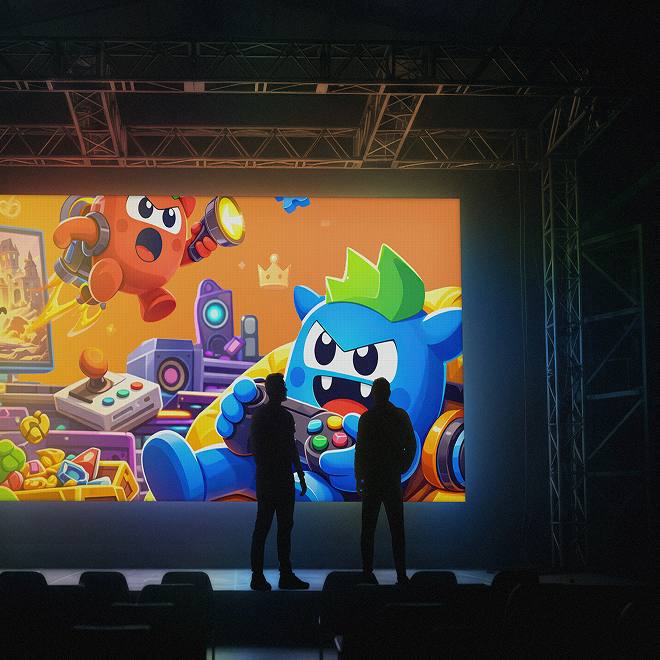
Logo and visual identity. We delivered at least two initial versions, followed by a round of refinement. The color palette, typography for headings and body text, and usage guidelines were precisely defined. The platform’s mascot—the most visible embodiment of a gaming brand’s personality—was rebuilt from scratch: more expressive, more consistent with the new visual system, and more adaptable to various usage contexts.
Application visuals. We brought the identity to life in real-world contexts: business cards, banners, social media, posters. Not decorative mockups, but tools that test the visual system’s resilience to variation and scale.
Brand manual. We delivered a comprehensive document containing primary and secondary specifications, the color palette, usage rules, patterns, clearance guidelines, style rules, and common pitfalls to avoid. A guide that can be used by anyone, not just designers.
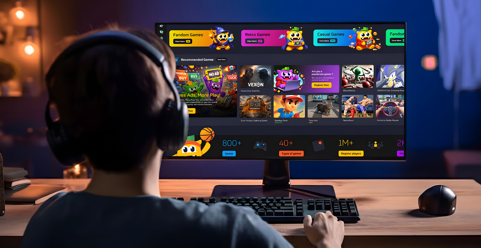
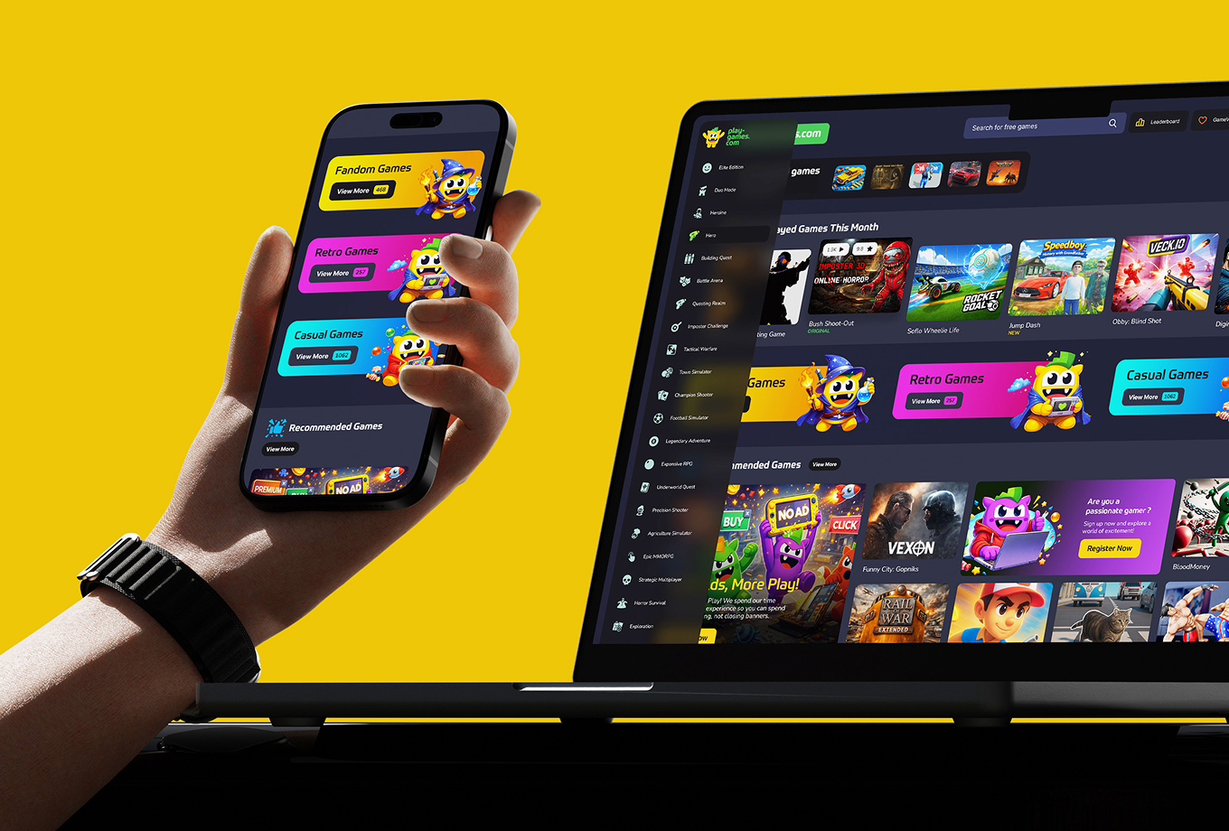
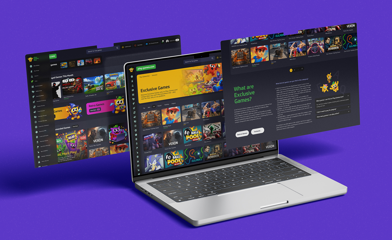
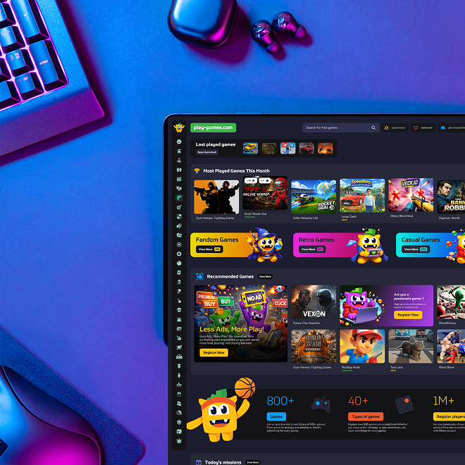
Partial redesign of the platform. The visual changes to the website aligned with the new brand identity without rebuilding everything from scratch—in line with the client’s vision. We structured the information architecturally, created wireframes for the contracted pages, and delivered the interface design and partial iconography. Each redesigned page now reflects the consistency of a brand with a clear direction.
Outcomes
Our partnership with Play-games.com demonstrates that a well-executed brand refresh doesn’t mean throwing away everything you’ve built—it means giving meaning to what already exists.
By combining strategic workshops with a rigorous branding process and a consistent visual redesign, we transformed a platform with a loyal audience but a vague identity into a brand with a clear personality, a unified visual system, and a mascot that communicates.
The result is a solid foundation upon which Play-games.com can build with confidence—in its communication, its product, and its relationship with its users.