The challenge
The European Space Policy Institute (ESPI) is an independent think tank that provides decision-makers with information and analysis on European space activities. After nearly 20 years of operation, ESPI recognized the need to refresh its brand identity and online presence to reflect the evolving space sector and maintain its relevance.
After two decades, ESPI faced challenges stemming from a dynamic space sector. The emergence of new players intensified competition, necessitating innovation to stay relevant. Simultaneously, the evolving identities of national space agencies demanded continuous updates to ESPI’s analyses for accuracy.
Additionally, the constant influx of new issues required agility in providing timely insights. Upholding its independent platform, ESPI needed to navigate these changes while maintaining objective, long-term perspectives. The rebranding effort itself added another layer of adaptation, requiring the integration of a refreshed visual identity while preserving the core mission.
Strategy
The aim of this project was a two-step reconstruction of ESPI identity and online presence. We have developed a modern visual identity language with a new modern website, delivering new clothes for ESPI and its team.
A new logo and a consistent visual identity
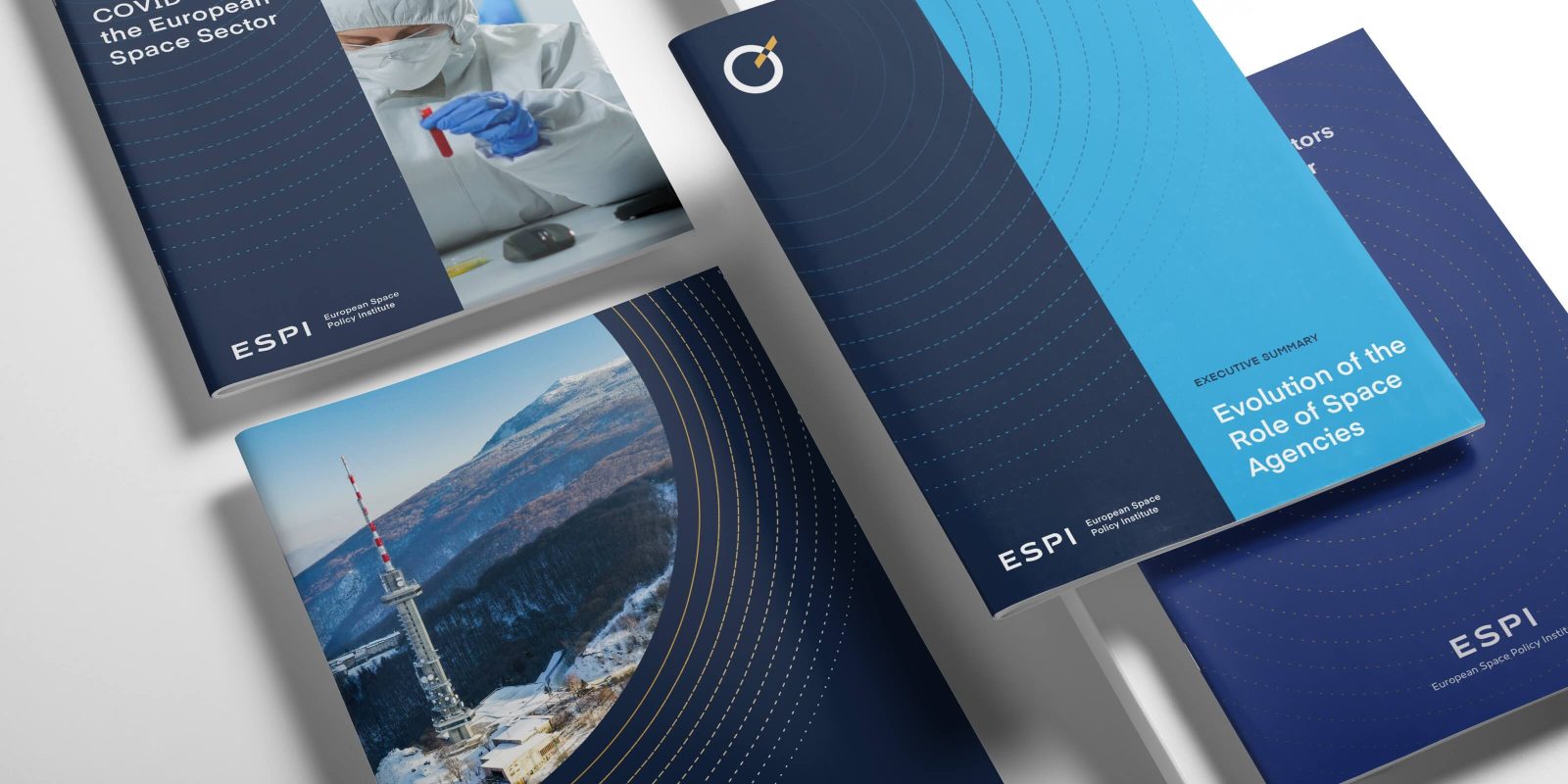
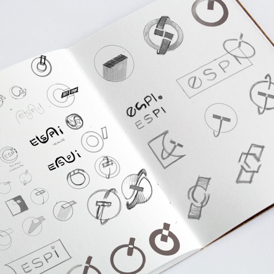
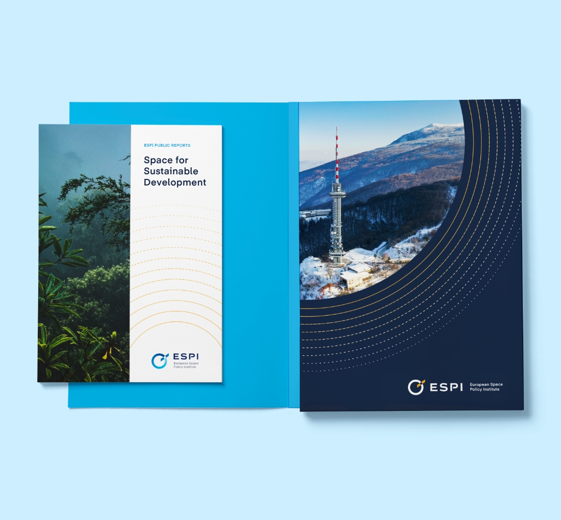
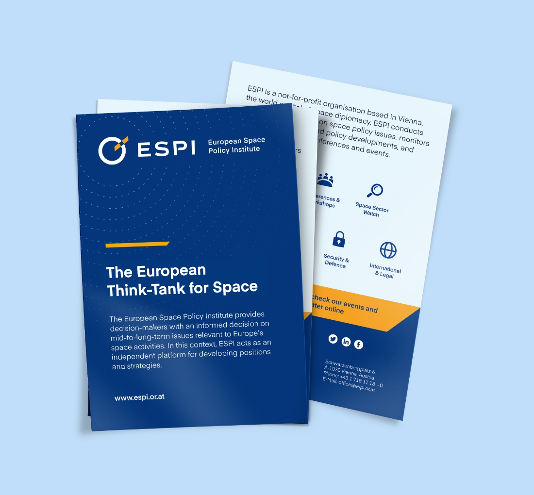
The initial phase centered on revitalizing ESPI’s visual identity. We modernized the existing logo, incorporating a clean, universally recognizable icon. Subsequently, we developed a suite of cohesive brand materials, ensuring consistency across various touchpoints. This involved a collaborative strategy workshop to pinpoint ESPI’s brand essence, followed by meticulous research and design execution.
A more modern and user-friendly website
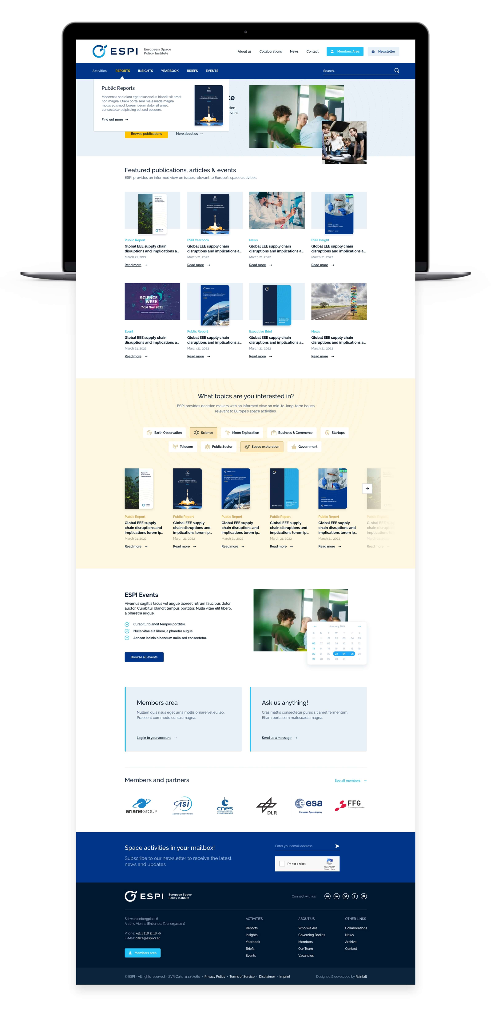
The second phase focused on creating a user-friendly WordPress website (www.espi.or.at/). Our goal was to enhance the visitor experience through new features. These included dedicated pages for News, Reports, and Briefs, and the ability to read executive briefs online. We also implemented a topic-based publication search and improved readability with better font formatting.
Through the new website, ESPI should be able to communicate news and reports, organize events, offer downloadable documents and manage the member’s area.
The steps of this second stage were: site architecture and wireframe, UI/UX design, web development, maintenance, and website hosting services.
The logo consists of the acronym “ESPI” in a bold, sans-serif typeface, accompanied by its symbol
representing a planet orbited by a satellite. The colour palette is predominantly blue and white, conveying professionalism and trustworthiness. The website features clean lines, a spacious layout, and a balanced mix of text and imagery, creating a visually appealing and user-friendly experience.
The creation of a new, user-friendly website was central to ESPI’s approach, aiming to enhance user experience and provide better access to information. The website was designed to be a central platform for communicating news and reports, organizing events, offering downloadable documents, and managing the member’s area.


Nothing brings a brand to life faster than creative production storytelling
Outcomes
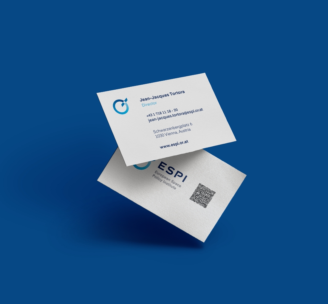
For ESPI, we developed a range of creative concepts for both digital and print materials, ensuring consistency across platforms. This included designs for social media, brand identity materials, and templates for various document types. Additionally, we designed layouts for reports, brochures, and other promotional materials to enhance ESPI’s professional image.
Through this comprehensive rebranding effort, ESPI successfully modernized its identity and online presence. The refreshed visual identity and user-friendly website strengthened ESPI’s communication channels. This allowed for better engagement with their target audience, ultimately helping ESPI maintain its position as a leading voice in European space policy.
