The challenge
De La Neamu is a brand with a rich history originating in Deta, a small town in the western part of Romania. Pretzels, crackers, and homemade chocolate bars are De La Neamu’s specialities. They can be purchased and enjoyed directly from hypermarkets in Romania, but also in other European countries, such as Germany, Spain, or Italy.
Strategy
Supermarket shelves are a battlefield, packed with thousands of sweet and savoury treats. Just surviving in this market is an achievement, let alone trying to stand out and win over new customers. But for De la Neamu, that kind of challenge is what makes the business exciting.
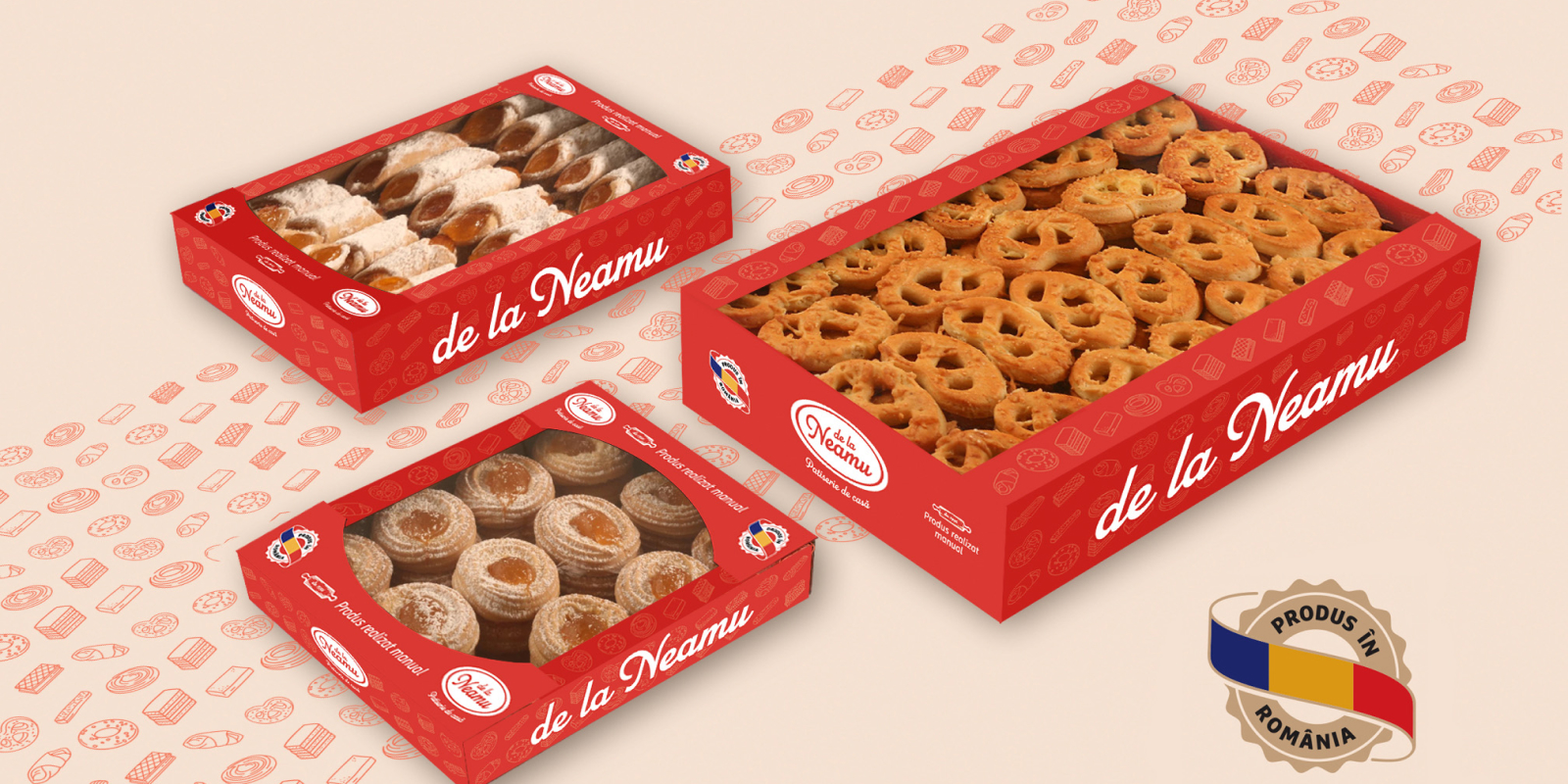
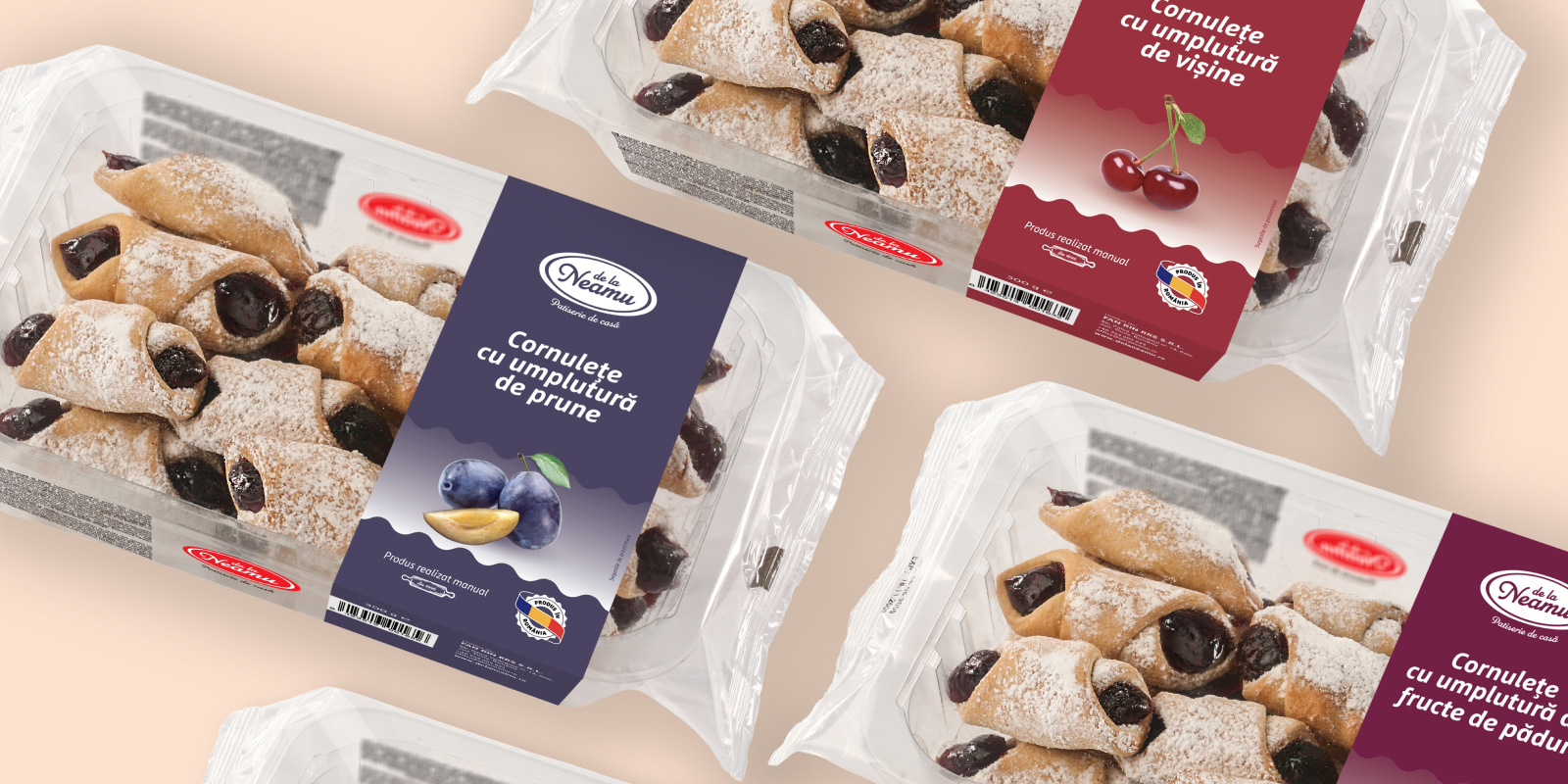
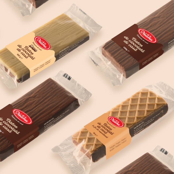
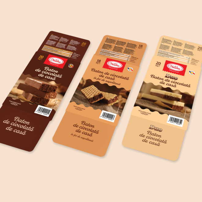
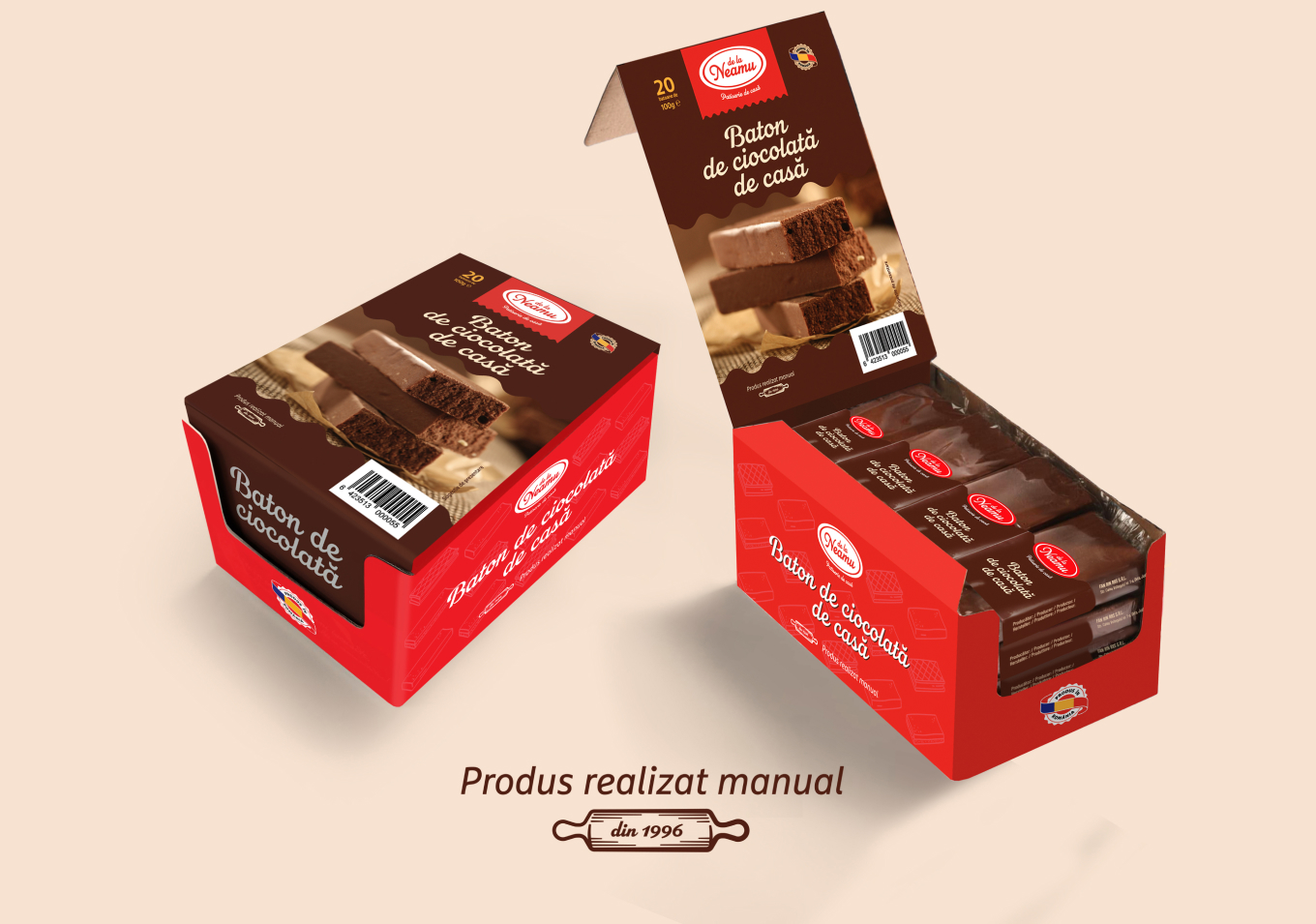
As you know, on a crowded shelf, a brand isn’t just selling a product; it’s competing for attention. Its visual identity is its most valuable real estate. That’s exactly why the owners decided it was time for a refresh. They wanted better shelf visibility and packaging that looked as good as the product tasted—all without losing the familiar feel that loyal customers already know and love.
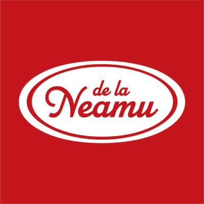
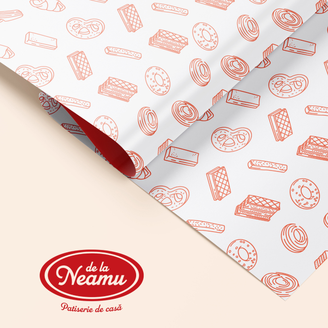
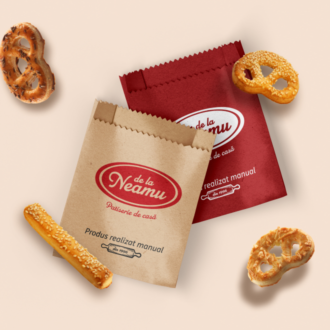
The original De la Neamu brand had strong points, like a consistent color palette and recognizable visuals. But the logo was complex and lacked the punch it needed. We started the rebrand by redesigning the logo, then fine-tuned the fonts, updated the icons, and added new elements that celebrate the brand’s Romanian heritage.
This fresh look gives the brand a powerful boost. We revamped the boxes and wrappers with eye-catching designs that make the products stand out. We also made sure all the artwork was perfectly prepared for printing, ensuring every package looks flawless, no matter the volume.
On a crowded shelf, a brand isn't just selling a product; it's competing for attention. Its visual identity is crucial.
Outcomes
With a brand that now looks as good as its products taste, De la Neamu is ready to deliver its beloved classics and introduce new assortments with confidence.